Seattle Reign FC - Behind the Brand
OL Reign today unveiled its official name and brand transformation, bringing back the club’s original name, Seattle Reign FC, while reimagining the club’s iconic crest from its inaugural season in 2013.
The club’s 12-year evolution has come full circle within its renewed identity ahead of the 2024 NWSL season. The name Seattle Reign FC was used throughout the club’s first six seasons of play at Starfire Stadium (2013) and Memorial Stadium (2014-2018) and was at the forefront of the club’s identity as it won back-to-back NWSL Shields in 2014 and 2015.
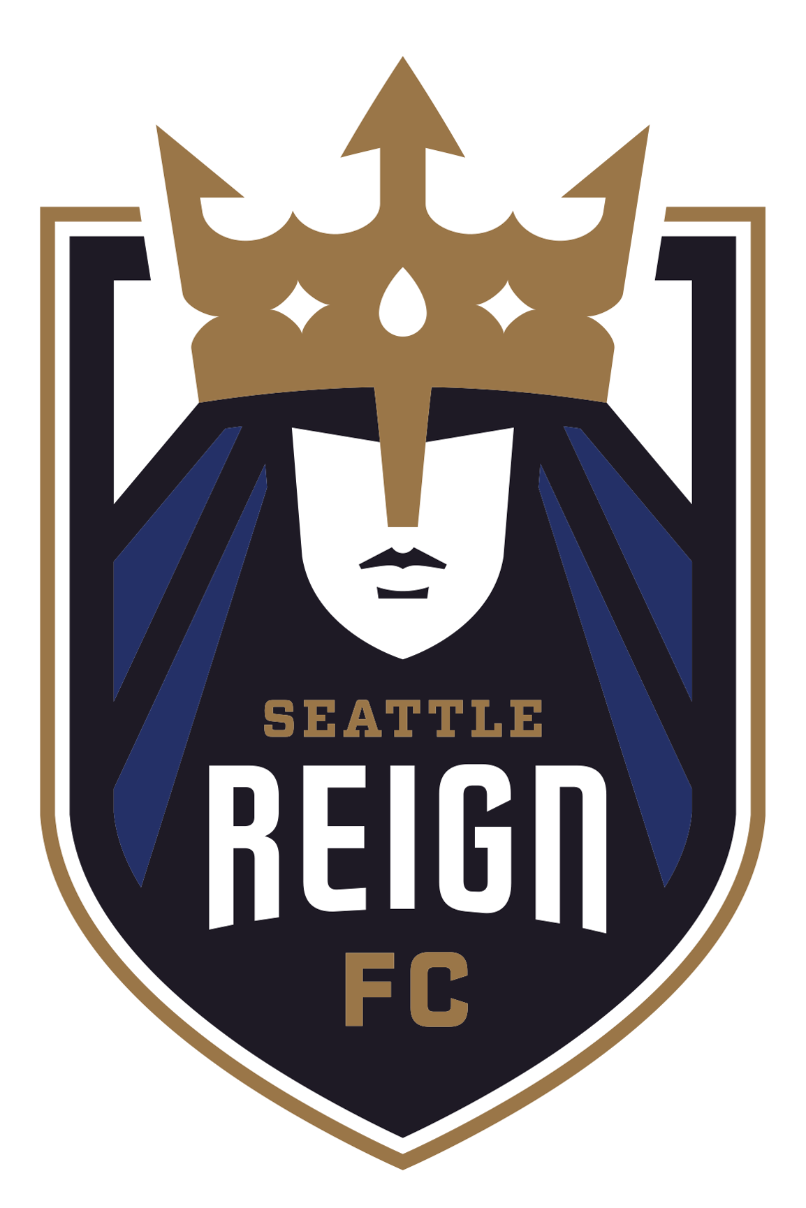
With the addition of a newly transformed version of the iconic crest, featuring the original queen and Seattle Reign FC design in a refreshed color palette, the Reign are returning to their roots. As it has since the 2013 off season, the club will retain its moniker “The Bold.”
The new crest primarily features aspects of the original crest used during the early years of Seattle Reign FC while adding a refreshed color palette that illustrates tones of the past through shades of blue and a prominent gold that symbolizes the club’s historical success, which includes three NWSL Shields and seven playoff appearances.
Seattle Reign FC’s restored brand identity, largely inspired by the club's original branding, marks the fourth iteration of the club’s name and crest. Most recently, the club was named OL Reign from 2020-2023 as part of the Olympique Lyonnais family under OL Groupe. Prior to OL Groupe’s acquisition of the club in 2020, the team played in Tacoma as Reign FC for the 2019 season.
Embracing an evolved version of the club’s original branding signifies a return home for the Reign. Through the last 12 years of challenges, the values have prevailed. Though the club will proudly don this new crest, it’s never been the crest or team name that defines the Reign. It’s the sense home felt at every Reign game, sustained by the fans, our originals and every person that has backed this club since day. It’s our strength, resilience, boldness and pride that have remained our greatest asset through every challenge thrown our way.
Let the restoration begin, Seattle.
NAME
The founding name of the club, Seattle Reign FC, returns in 2024. The name was previously used between the 2013 and 2018 seasons, when the club played at Starfire Stadium and Memorial Stadium. Now, as the club embarks on its third season playing at Lumen Field, in the heart of Seattle, Seattle Reign FC will proudly be recognized as the club’s name once again.
This name holds great meaning for this club and region. Not only is it backed by years of grit and determination from this club, but it holds greater historical significance as intended when the club was founded over a decade ago.
When the naming process for the team originally began, the process was very literal before it became clear that the club would need to take a step further and produce something that was more symbolic. The literalness of a siren dissipated into something more. Something that better represented this team, and what it stands for. In honor of the Seattle-based women’s basketball team of the 90’s, the club landed on Seattle Reign FC.
The name not only honors the rich history of women’s sports in Seattle, but also pays homage to the visionaries and leaders involved with the Seattle Reign women’s basketball team.
CREST AND COLORS
Seattle Reign FC’s primary crest reflects the club’s unique logo used from the inaugural season in 2013 through the 2018 season, which saw two NWSL Shields and two NWSL Championship appearances, embracing the club’s historical success and deep roots to the city of Seattle.
The new crest primarily features aspects of the original crest used during the early years of Seattle Reign FC while adding a refreshed color palette that illustrates tones of the past through shades of blue and a gold that symbolizes the club’s historical success from some of the most decorated players in the world.
Reflecting on the past while propelling towards the future, the iconic queen forefronts the revitalized crest, bringing back an image that embodies the exponential growth in professional women’s sports. The unyielding queen is featured with refreshed color tones of Seattle Reign Blackened Blue and Seattle Reign Blue – two colors that pay tribute to the original colors of Seattle Reign FC, while taking root in the deep colors of the Seattle environment the team calls home. Inset into the queen's crown in a single rain drop – another tribute to the incredible city the Reign calls home.
In addition to the refreshed tones of blue within the crest, the crown and outline that encompasses the badge features Seattle Reign Gold to symbolize the club’s successes on and off the pitch. This new shade of gold, along with the club’s Seattle Reign Sesame, Summit White and Diffused Blue, highlight the royal club’s return to its founding name by using updated warm and regal tones in the place of the cool tones of the past.
DESIGN ELEMENTS
The other design elements featured in Seattle Reign FC’s transformed brand include an updated pictorial mark and two evolved wordmarks.
The crown acts as the Reign’s primary pictorial mark. Always featured in a single color, this royal emblem emphasizes the regal legacy of the club and the return of the beloved queen.
The primary and secondary wordmarks both feature the club’s name, Seattle Reign, both in color and a single shade. The secondary wordmark is simple, leaving the core of the team’s name to stand for itself. The primary wordmark brings the royal elements of the club's legacy back in, punctuated by a crown and decorated “FC.”