Seattle Reign FC Makes Triumphant Return Ahead of 2024 Season

OL Reign today unveiled its official name and brand transformation in time for the new season, returning to the roots of the club’s original name, Seattle Reign FC. The club’s iconic crest from its inaugural season in 2013 has been reimagined for a new era.
“Today is the start of a new chapter for our unique club, fans and community,” said Seattle Reign FC CEO Vincent Berthillot. “Bringing back the club’s original name and identity from the 2013 season as the club prepares to enter a new era is our way of honoring the history of this club while respecting the progress and success we’ve experienced firsthand. Seattle Reign FC was a founding club in this growing league, and our OGs, our supporters and our community have remained by our side from the very beginning to help pave the way for the future.”
The club’s 12-year evolution has come full circle within its renewed identity ahead of the 2024 NWSL season. The name Seattle Reign FC was used throughout the club’s first six seasons of play at Starfire Stadium (2013) and Memorial Stadium (2014-2018) and was at the forefront of the club’s identity as it won back-to-back NWSL Shields in 2014 and 2015.
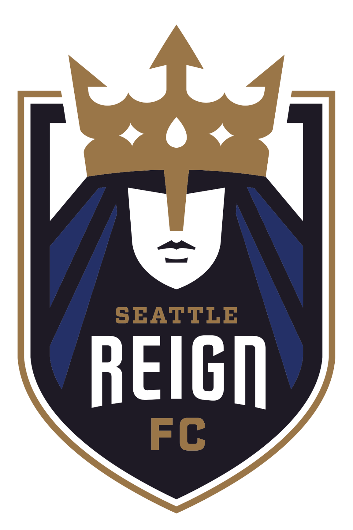
The new crest features aspects of the original crest used during the early years of Seattle Reign FC while adding a refreshed color palette echoing the past using shades of blue and introducing gold to symbolize the club’s historical success, which includes three NWSL Shields and seven playoff appearances.
“The Reign brand goes far beyond the name and crest, but when considering the opportunity in this moment to link our past to the future, there was no doubt about the connection this mark has to the legacy and identity of this storied club,” said Seattle Reign FC VP of Marketing and Ticketing Michelle Haines. “Ultimately, this refreshed look is an embodiment of our roots in Seattle, honors the dedication of our fans, reflects the caliber of our players and aligns with our core values.”
Seattle Reign FC’s restored brand identity, largely inspired by the club's original branding, marks the fourth iteration of the club’s name and crest. Most recently, the club was named OL Reign from 2020-2023 as part of the Olympique Lyonnais family under OL Groupe. Prior to OL Groupe’s acquisition of the club in 2020, the team played in Tacoma as Reign FC for the 2019 season.
Additional insights into the club’s refreshed identity can be found below.
NAME
The founding name of the club, Seattle Reign FC, returns in 2024. The name was previously used between the 2013 and 2018 seasons, when the club played at Starfire Stadium and Memorial Stadium. Now, as the club embarks on its third season playing at Lumen Field, in the heart of Seattle, Seattle Reign FC will proudly be recognized as the club’s name once again.
CREST AND COLORS
Embracing the club’s historical success and deep roots to the city of Seattle, the club’s primary crest reflects Seattle Reign FC’s unique logo used from the inaugural season in 2013 through the 2018 season, which saw two NWSL Shields and two NWSL Championship appearances.
Reflecting on the past while propelling towards the future, the iconic queen forefronts the revitalized crest, bringing back an image that embodies the exponential growth in professional women’s sports. The queen is featured with refreshed color tones of Seattle Reign Blackened Blue and Seattle Reign Blue – two colors that pay tribute to the original colors of Seattle Reign FC, while taking root in the deep colors of the Seattle environment the team calls home.
In addition to the refreshed color tones within the crest, the crown and outline that encompasses the badge features Seattle Reign Gold to symbolize the club’s league-leading three NWSL Shields. Seattle Reign Gold is also illustrated in the words ‘Seattle’ and ‘FC’ within the crest, highlighting the royal club’s return to its founding name. This new shade of gold, along with the club’s Seattle Reign Sesame, Summit White and Diffused Blue uses updated warm and regal tones in place of the cool tones of the past.
DESIGN ELEMENTS
The other design elements featured in Seattle Reign FC’s transformed brand include an updated pictorial mark and two evolved wordmarks. The crown acts as the Reign’s primary pictorial mark. Always featured in a single color, this royal emblem emphasizes the regal legacy of the club and the return of the beloved queen. The primary and secondary wordmarks both feature the club’s name, Seattle Reign, both in color and a single shade.
ADDITIONAL INFORMATION
The club’s digital presence has also been updated to reflect the new branding. Seattle Reign FC can be found under the handle @ReignFC on social media platforms and on the web at www.reignfc.com.
Seattle Reign FC merchandise is available for preorder at www.reignfcshop.com. The first-of-its-kind merchandise includes tees, headwear, scarves and more.